Weekend data wrangle - CDP water supply risk
/ Sean Turner
This weekend’s data wrangle looks at the CDP Cities Water Risks dataset.
This dataset includes the urban risks to water supply as reported by cities in the 2018 CDP Cities questionnaire. Details of the risks alongside their magnitude of impact and timescale are included. For responses to other questions in 2018, please view the 2018 Full Cities dataset.
I saw the CDP’s logo on the front of a recent Pacific Institute report (see post from Tuesday), so I thought I’d check out their data. They’ve surveyed the water utilities of hundreds of cities to characterize global urban water supply risks.
Sounds promising…
First I’m gonna load some libraries and download the dataset:
library(vroom)   # for data download
library(dplyr)   # for data wrangle
library(purrr)   # for applying functions
library(ggplot2) # for plotting

# download data
vroom("https://data.cdp.net/resource/qaye-zhaz.csv") %>%
  # remove unnecessary columns
  select(-access, -c40, -account_no) ->
  data

# show summary of water supply risks in data
data %>% count(risks_to_city_s_water_supply)
## # A tibble: 9 x 2
## risks_to_city_s_water_supply n
## <chr> <int>
## 1 Declining water quality 117
## 2 Flooding 121
## 3 Higher water prices 55
## 4 Inadequate or aging infrastructure 114
## 5 Increased water stress or scarcity 240
## 6 Other 26
## 7 "Other " 1
## 8 Regulatory 18
## 9 Water losses 17So we have seven main risk types documented. The most common in the dataset are declining water quality, flooding, bad infrastructure, and increasing water stress.
Each risk has categorized by each reporting city utility according to seriousness. This is where the survey becomes silly. Clearly a utility’s definition of “extremely serious” is completely context dependent; this problem will emerge in the final plot.
I want to identify the world’s top 20 high risk cities. So I’ve devised a simple scoring system based on number of risks and reported seriousness:
(the data are quite messy, so please excuse the long-winded wrangle!)
# get risks (remove unhelpful "other" category)
risks <- data[["risks_to_city_s_water_supply"]] %>% unique() %>%
  .[!grepl("Other", .)]

# run through all cities...
# ... fill out holes in dataset with NA
data %>% pull(city) %>% unique() %>%
  map_dfr(function(city){

    filter(data, city == !! city) %>%
      select(risk = risks_to_city_s_water_supply,
             magnitude) -> city_risks

    # deal with cases where a single city reports ...
    # ... multiple risks in single risk category
    city_risks %>% count(risk, magnitude) %>%
      arrange(-n) %>%
      split(.$risk) %>%
      map_dfr(function(x) x[1,]) %>%
      select(-n) %>%
      right_join(tibble(risk = risks),
                 by = "risk") %>%
      # clean up NA vs "NA"
      mutate(city = !!city,
             magnitude = if_else(
               is.na(magnitude) | magnitude == "NA",
               "None", magnitude))
  }) %>%
  # make magnitude category a factor
  # (this helps with plotting)
  mutate(magnitude = factor(magnitude,
                            levels = c(
                              "Extremely serious",
                              "Serious",
                              "Less serious",
                              "None"
                            ))) ->
  data_for_plot

# color scheme for risk categories
viridis::inferno(3, begin = 0.9, end = 0.5, direction = -1) -> cols
c(
  "Extremely serious" = cols[1],
  "Serious" = cols[2],
  "Less serious" = cols[3],
  "None" = "white"
) -> risk_palette

# scoring to get top 20 highest risk cities
data_for_plot %>%
  mutate(mag_score = case_when(
    magnitude == "Extremely serious" ~ 3,
    magnitude == "Serious" ~ 2,
    magnitude == "Less serios" ~ 1,
    TRUE ~ 0
  )) %>%
  group_by(city) %>%
  summarise(risk_score = sum(mag_score)) %>%
  arrange(-risk_score) %>% top_n(20) ->
  top_20_city_risk

data_for_plot %>%
  filter(city %in% top_20_city_risk[["city"]]) %>%
  mutate(city = factor(city, levels = rev(top_20_city_risk[["city"]]))) %>%
  ggplot(aes(risk,city, fill = magnitude)) +
  geom_tile(col = "black") + theme_classic() +
  theme(axis.text.x = element_text(angle = 45, hjust = 1, vjust = 1)) +
  scale_fill_manual(values = risk_palette) +
  labs(title = "Top 20 cities by water supply risk",
       subtitle = "An analysis based on seriously flawed data",
       caption = "Source: https://data.cdp.net/resource/qaye-zhaz.csv",
       fill = "Risk magnitude",
       y = NULL, x = NULL)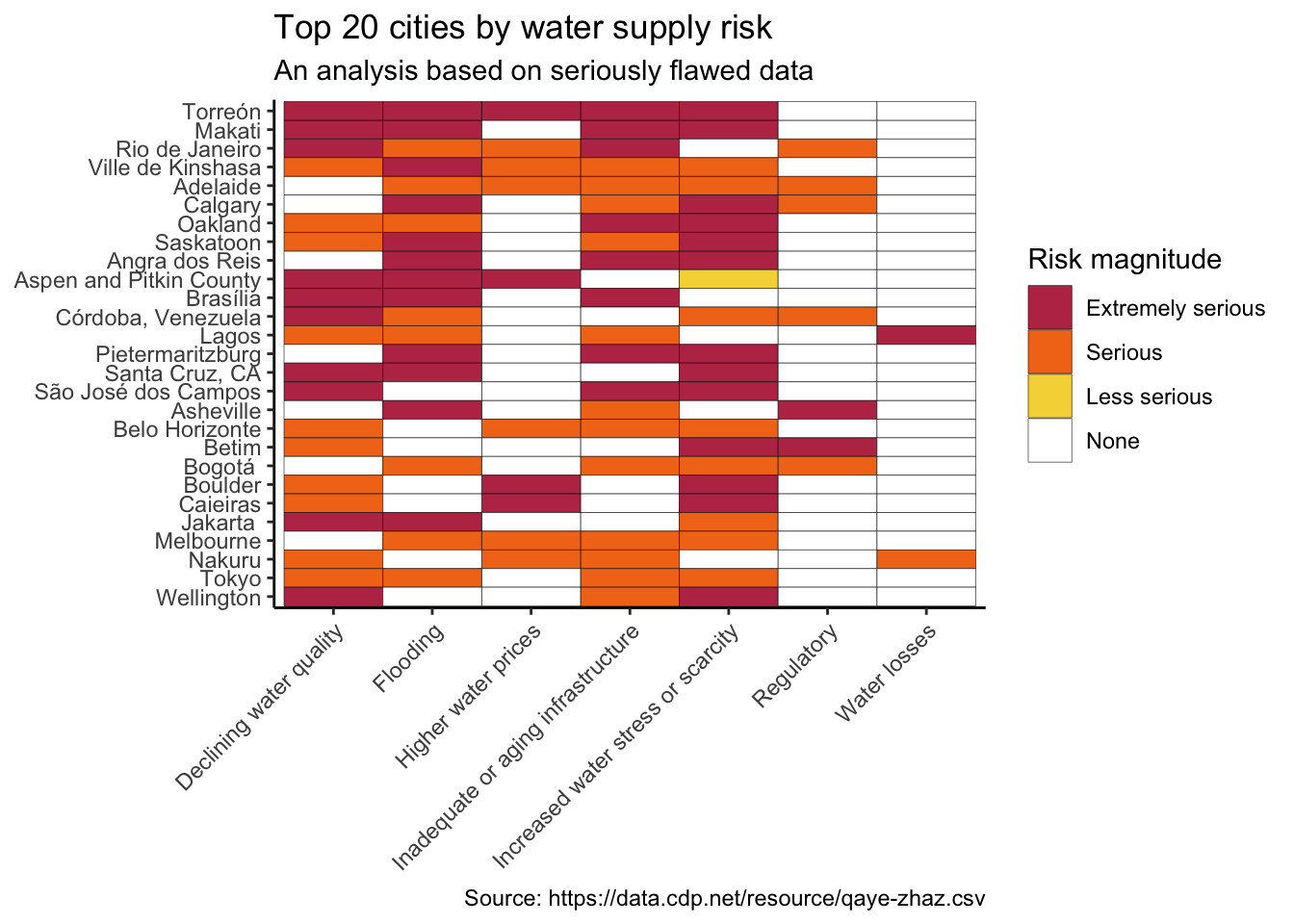
So the world’s number one highest risk city for water supply is… Torreón, Mexico. The Municipio de Torreón reported extremely serious risk for almost all categories. Then we cast the eye down the top 20 and find… Adelaide, Australia (5th highest water supply risk!!), Calgary, Canada (6th), Oakland, USA (7th)… you get the picture.
Saskatoon faces greater water supply risk than Jakarta.
These data are clearly useless. A lot of work must have gone into contacting water utilities around the world. It’s a great shame that the survey team failed to collect any quantifiable statistics that would allow for a reasonable analysis of global city water supply risks.