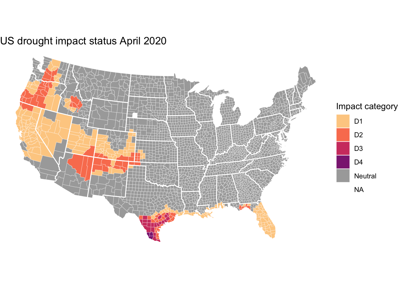
Two-minute plot - county-level drought impact categories
/ Sean Turner
The University of Nebraska Lincoln maintains an excellent United States Drought Monitor providing drought impact categories at various levels of granularity.
Here’s a demo for quickly loading, wrangling, and plotting this week’s county-level data.
First we need some libraries…
library(vroom)   # for data reading
library(dplyr)   # for data wrangling
library(ggplot2) # for plotting
library(viridis) # for nice color scheme
Then we need to read the data. The county-level data gives % land area within each drought category. Here I’m just going to use dplyr::case_when to select the most severe impact category present in each county.
vroom("https://droughtmonitor.unl.edu/Data/GISData.aspx?mode=table&aoi=county&date=") %>%
  mutate(worst_case_impact = case_when(
    D4 > 0 ~ "D4",
    D3 > 0 ~ "D3",
    D2 > 0 ~ "D2",
    D1 > 0 ~ "D1",
    TRUE ~ "Neutral"
  )) %>%
  select(fips = FIPS, worst_case_impact) %>%
  mutate(fips = as.integer(fips)) ->
  county_impact
Then I’m gonna read some county polygon data using the map_data function of ggplot2:
map_data("county",
         projection = "albers",
         parameters = c(39, 45)) %>%
  as_tibble() %>%
  rename(state = region, county = subregion) ->
  county_data
My county name formats are not consistent–so I need some additional info to connect the drought data to the polygons. I’m gonna use a dataset in the maps package to get county FIPS code that will allow for a clean join:
maps::county.fips %>%
  as_tibble() %>%
  tidyr::separate(polyname, into = c("state", "county"), sep = ",") ->
  fips_state_county

county_data %>%
  left_join(fips_state_county) %>%
  left_join(county_impact) ->
  county_plot
And now for the plot.
# US state boundaries
map_data("state",
         projection = "albers",
         parameters = c(39, 45)) ->
  state_boundaries

# color scheme
c(viridis(4, option = "A", direction = -1,
          begin = 0.4, end = 0.9),
  "darkgrey") -> drought_cols

# main plot
county_plot %>%
  ggplot(aes(long, lat, group = group)) +
  geom_polygon(aes(fill = worst_case_impact),
               colour = alpha("white", 1 / 2),
               size = 0.2) +
  geom_polygon(data = state_boundaries,
               colour = "white", fill = NA) +
  coord_fixed() +
  theme_void() +
  labs(title = "US drought impact status April 2020",
       fill = "Impact category") +
  scale_fill_manual(values = drought_cols)