Coxcomb charts for monthly river discharge
/ Sean Turner
Here’s a beautiful example of a Coxcomb visualization for monthly mean river discharge:
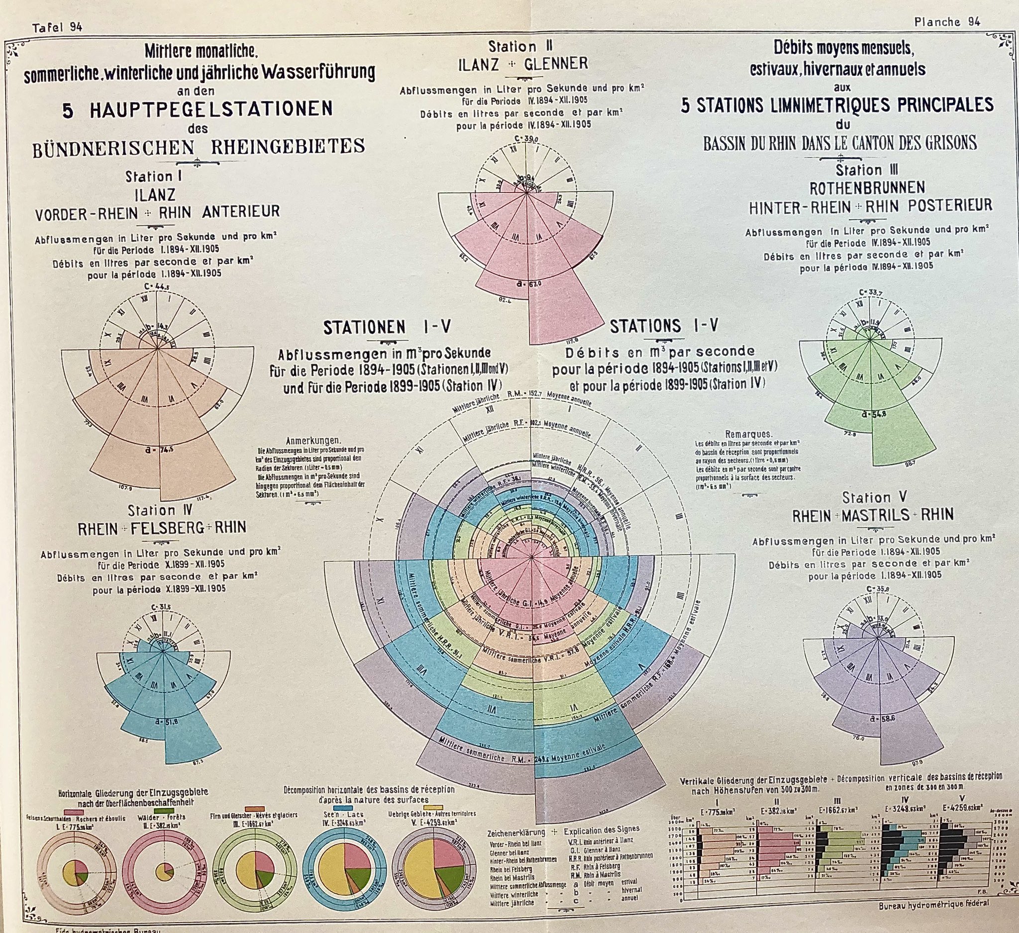
I saw this on Twitter recently, here (shout out to Matthias Sänger for sharing!!).
Coxcomb charts work so nicely for monthly summaries because the provide continuity between all the periods. They also just look great.
Here’s a quick tutorial for how to reproduce a river discharge Coxcomb plot from daily flow data. For this you’ll need to install dataRetrieval—a package provided by USGS that allows you to download US station data straight into your R environment.
library(dplyr)          # data wrangling
library(lubridate)      # for working with dates
library(ggplot2)        # plotting
library(dataRetrieval)  # flow data access
Using the USGS site mapper I identified three station IDs for each of the main tributaries to the Mississippi (Upper Mississippi, Missouri, and Ohio Rivers). These station IDs are used to access the available daily flow data in cubic feet per second:
dataRetrieval::readNWISdv(siteNumbers = c("06935965",
                                          "05587455",
                                          "03612600"),
                          parameterCd = "00060",
                          # ^^ 00060 => discharge
                          startDate = "1980-10-01",
                          endDate = "2019-09-30") %>%
  as_tibble() %>%
  rename(flow_cfs = X_00060_00003) %>%
  mutate(site = case_when(
    site_no == "06935965" ~ "Missouri River",
    site_no == "05587455" ~ "Upper Mississippi River",
    site_no == "03612600" ~ "Ohio River"
  )) -> flow_data
Convert to monthly means:
flow_data %>%
  group_by(site, month = month(Date, label = T)) %>%
  summarise(mean_flow_cfs = mean(flow_cfs)) %>%
  ungroup() -> monthly_flow_means
To plot the Coxcomb chart, start with a normal bar chart:
monthly_flow_means %>%
  ggplot(aes(month, mean_flow_cfs)) +
  facet_wrap(~site, nrow = 1) +
  geom_bar(stat = "identity", width = 1,
           col = "black", fill = "dodgerblue") -> p1

p1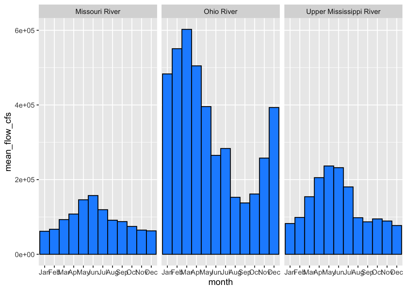
Then just add coord_polar():
p1 + coord_polar() -> p2

p2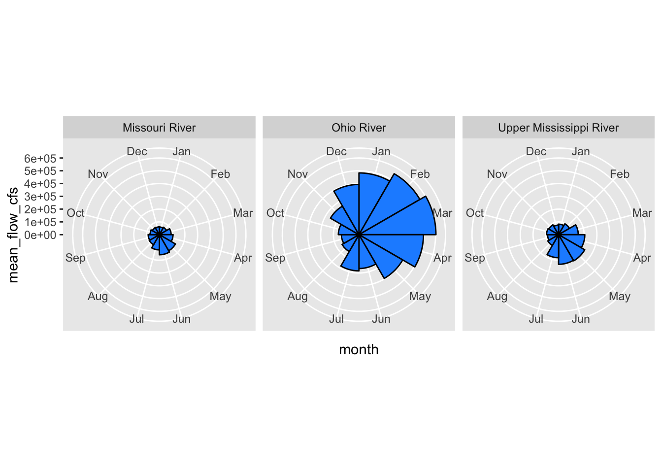
And clean up:
p2 + theme_bw() +
  labs(y = NULL, x = NULL,
       title = "Mississippi River Seasonal Flow Profile",
       subtitle = "Mean monthly flow (cfs)") +
  theme(panel.grid.major.x = element_blank(),
        strip.background = element_blank(),
        strip.text = element_text(size = 14,
                                  color = "dodgerblue",
                                  face = 3),
        panel.border = element_blank()) -> p3

p3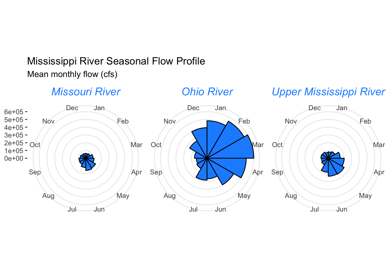
Or like this…
p3 + geom_bar(aes(fill = site),
              stat = "identity", width = 1,
              col = "black") +
  facet_wrap(facets = NULL) +
  theme(strip.text = element_blank()) +
  labs(fill = NULL)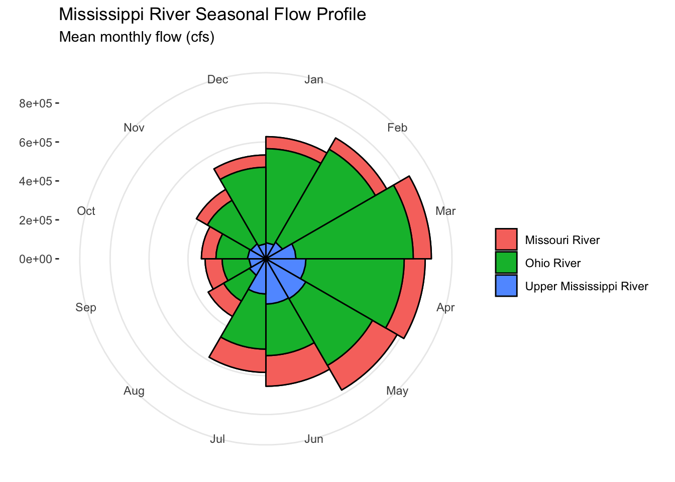
Enjoy.