Surface water, groundwater supply split for a hundred U.S. cities
/ Sean Turner
I published this paper recently and some folks have asked me to share my code used to produce the figures. So in this post I’ll reproduce the main panel of Figure 1 (below) and also jazz things up with an interactive version of the figure. Here’s the figure:
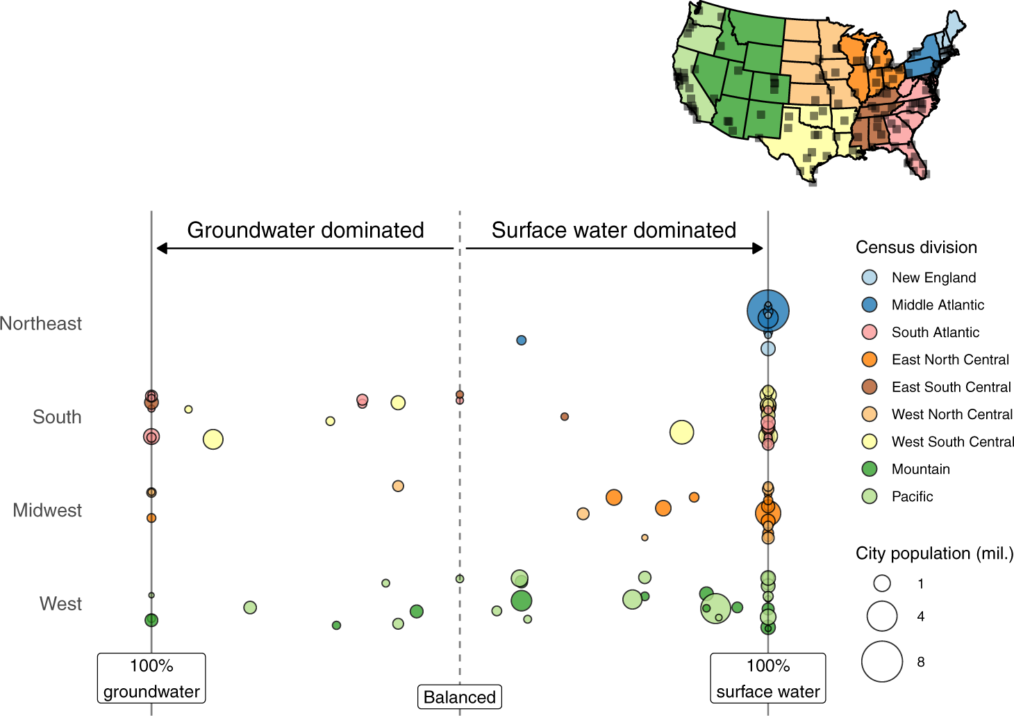
Fig. 1 from Turner et al. (2021), showing relative contributions of surface water and groundwater to total water supply for 116 large United States cities.
First we’ll need the output data from the study, which is available on Zenodo and can be grabbed straight from the web using vroom.
library(vroom)
vroom("https://zenodo.org/record/5813878/files/supply%20contributions.csv?download=1",
      comment = "#",
      col_types = cols()) ->
  supply_contrib
head(supply_contrib)
## # A tibble: 6 × 6
## city supply_index state region division city_population
## <chr> <dbl> <chr> <chr> <chr> <dbl>
## 1 Akron | OH 1 OH Midwest East North C… 198006
## 2 Albuquerque | NM -0.14 NM West Mountain 560218
## 3 Amarillo | TX -0.88 TX South West South C… 199924
## 4 Atlanta | GA 1 GA South South Atlant… 498044
## 5 Augusta-Richmond | GA 0 GA South South Atlant… 196939
## 6 Aurora | CO 0.9 CO West Mountain 374114The data include a supply_index variable for each of 116 U.S. cities. The supply index (-1 to 1) indicates the share of each city’s water supply coming from surface and groundwater resources. A supply index of 1 means 100% surface water, 0 means even split, and -(1) means 100% groundwater.
The plot is made with ggplot2, and is essentially showing the distribution of the “supply index” across cities in each major U.S. region. The first thing we need to do is wrangle the data a litte. First, convert the city population variable to units of millions of people (avoid unnecessary zeros in legend). Then convert the region and division variables to factors to dictate the order in which these appear in the figure and figure legend.
library(dplyr)

supply_contrib %>%
  mutate(city_population = city_population * 1e-6,
         region = factor(region,
                         levels = rev(c("Northeast",
                                        "South",
                                        "Midwest",
                                        "West"))),
         division = factor(division, levels = c("New England",
                                                "Middle Atlantic",
                                                "South Atlantic",
                                                "East North Central",
                                                "East South Central",
                                                "West North Central",
                                                "West South Central",
                                                "Mountain", "Pacific"))) ->
  supply_contrib_plot_ready
One way of plotting these distributions is simply to plot the points in a line:
library(ggplot2)
ggplot(supply_contrib_plot_ready,
       aes(region, supply_index,
           fill = division,
           size = city_population)) +
  geom_point(pch = 21, alpha = 0.8)
This gives a feel for how cities are distributed according to water supply split, but it isn’t a particularly attractive or informative plot. There are some problems, such as multiple points at the extremes of each distribution overlapping and preventing us from viewing the number of cities with either 100% surface or 100% groundwater making u supply.
A useful way to avoid points overlapping in a distribution like this is to jitter the points, which we can do by switching geom_point with geom_jitter:
ggplot(supply_contrib_plot_ready,
       aes(region, supply_index,
           fill = division,
           size = city_population,
           text = city)) +
  geom_jitter(pch = 21, alpha = 0.8, width = 0.3, height = 0) ->
  p_basic_jitter
p_basic_jitter
We see that for each region many of the cities are reliant entirely on surface water to meet public water demand. The
 width and height arguments in geom_jitter specify how much “jittering” is allowed. By setting height = 0 we ensure the actual point values remain true while allowing some random jittering in the horizontal direction (within each category of data, or each census region in this case) using width = 0.3.
Next we’ll create a better color scheme with similar colors for cities within each region, providing some further nuance for census divisions. The RColorBrewer “paired” palette is useful:
library(RColorBrewer)
division_pal <- brewer.pal(12, "Paired")
division_pal_ordered <- division_pal[c(1, 2, 5, 7, 12, 8, 11, 4, 3)]
p_basic_jitter +
  scale_fill_manual(values = division_pal_ordered) +
  # remove grey background and gridlines
  theme_classic() ->
  p_paired_colors
p_paired_colors
Use a simple coord_flip() to switch the axes. Then make a few other minor adjustments too the layout and add some lines to represent the extremities and mid-point:
p_paired_colors +
  coord_flip() +
  scale_x_discrete(expand = expansion(0.4)) +
  scale_y_continuous(expand = expansion(0.2)) +
  geom_hline(yintercept = 0, alpha = 0.5, linetype = 2) +
  geom_hline(yintercept = -1, alpha = 0.5) +
  geom_hline(yintercept = 1, alpha = 0.5) +
  theme(axis.line = element_blank(),
        axis.ticks = element_blank(),
        axis.text.x = element_blank(),
        axis.text.y = element_text(size = 9)) ->
  p_flipped_and_cleaned
p_flipped_and_cleaned
Finally, add some labeling and annotate:
p_flipped_and_cleaned +
  # set point size breaks for legend
  scale_size_continuous(breaks = c(1, 4, 8), range = c(1, 12)) +
  # remove self-explanatory axis names and neaten up legend labels
  labs(y = NULL, x = NULL,
       fill = "Census division",
       size = "City population (mil.)") +
  # add labels and arrows
  annotate("text", x = 5, y = 0.5, label = "Surface water dominated", size = 3) +
  annotate("text", x = 5, y = -0.5, label = "Groundwater dominated", size = 3) +
  annotate("segment", y = 0.02, yend = 0.98, x = 4.8, xend = 4.8, arrow = arrow(length = unit(0.02, "npc"), type = "closed")) +
  annotate("segment", y = -0.02, yend = -0.98, x = 4.8, xend = 4.8, arrow = arrow(length = unit(0.02, "npc"), type = "closed")) +
  annotate("label", x = 0, y = 0, label = "Balanced", size = 3) +
  annotate("label", x = 0.2, y = 1, label = "100%\nsurface water", size = 3) +
  annotate("label", x = 0.2, y = -1, label = "100%\ngroundwater", size = 3) +
  # increase legend point sizes
  guides(fill = guide_legend(override.aes = list(size=4))) ->
  p_final

p_final
Finally, something we can’t do in a journal article (yet)… an interactive version that allows the reader to hover the cursor over each point to view the city:
library(plotly)
ggplotly(p_final,
         tooltip = "text") %>%
  hide_legend()
Enjoy!